7 Secret AI Website Builder Prompts That Turn a Vague Idea Into a Site That Actually Converts


You typed “build me a modern website for my business,” and the AI gave you a gradient hero, three feature cards, and a footer full of lorem ipsum. It looks fine for ten seconds. Then you notice it says nothing about who the site is for, what to do next, or why anyone should trust you.
The problem is rarely the AI tool. It is the prompt.
AI website builders (and coding assistants that generate pages) are very good at execution and very bad at guessing your strategy. Give them a vague brief and they fill every gap with the most average choice possible. Give them a sharp brief and the same tool produces something that feels human-designed, conversion-optimized, and brand-authentic.
This guide shares 7 prompts we call “secret” because most people never think to write them. They don’t ask for a style. They force the AI to think about the visitor, your real facts, and what could go wrong before launch. Each one is copy-and-paste ready: replace the {variables} and run it in ChatGPT, Claude, Gemini, or your favorite AI website generator.
The One-Sentence Visitor Prompt
Why it works: Most websites fail because the owner describes the business instead of the visitor’s situation. This prompt forces the AI to pinpoint the exact moment someone lands on your page and what internal dialogue is happening in their mind.
Best for: Starting any new site or rewriting a confusing, low-converting homepage.
Why it beats a normal prompt: The “worries about” clause surfaces the objection your page must answer. Most AI-generated pages ignore customer doubt completely and jump straight into cheerleading features.
Quick check: Read the visitor sentence aloud. If it could describe anyone, it is too broad. Rewrite it with a more specific situation and realistic friction point.
The Reverse Sitemap Prompt
Why it works: People usually plan a sitemap from the top down: Home, About, Services, Contact. This prompt starts at the goal (the conversion) and works backward to find only the pages and sections that actually help someone get there.
Best for: Small business sites, service sites, and any project drowning in “we might need a page for that.”
The Fact Vault Prompt
Why it works: AI loves to fill empty space with believable fiction: “Trusted by 10,000+ teams,” five-star reviews that don’t exist, and awards nobody gave you. This prompt creates a locked list of approved facts and establishes a strict negative constraint rule for everything else.
Best for: Any website that will go live to the public. Run this before you generate copy or code.
Pro tip: Keep your Fact Vault in a reusable text file or note and paste it at the top of every subsequent prompt. Consistency across your pages will improve dramatically.
The Five-Second Hero Test Prompt
Why it works: The top of your homepage has roughly five seconds to answer three essential questions: What is this? Is it for me? What do I do next? This prompt makes the AI write several hero variations and then brutally critique them through the eyes of a skeptical stranger.
Best for: Homepages and landing pages where the first viewport feels generic, cluttered, or weak.
Why the critique step matters: Without it, the AI will praise its own draft. Asking it to role-play a distracted, skeptical visitor immediately exposes fluffy slogans and vague jargon.
The Thumb-Zone Mobile Prompt
Why it works: Most AI previews look great on a wide desktop screen. But in real life, over 70% of visitors arrive on a phone, often holding it with one hand on a variable connection. This prompt designs around physical thumb reachability instead of merely squishing a desktop layout into a narrow column.
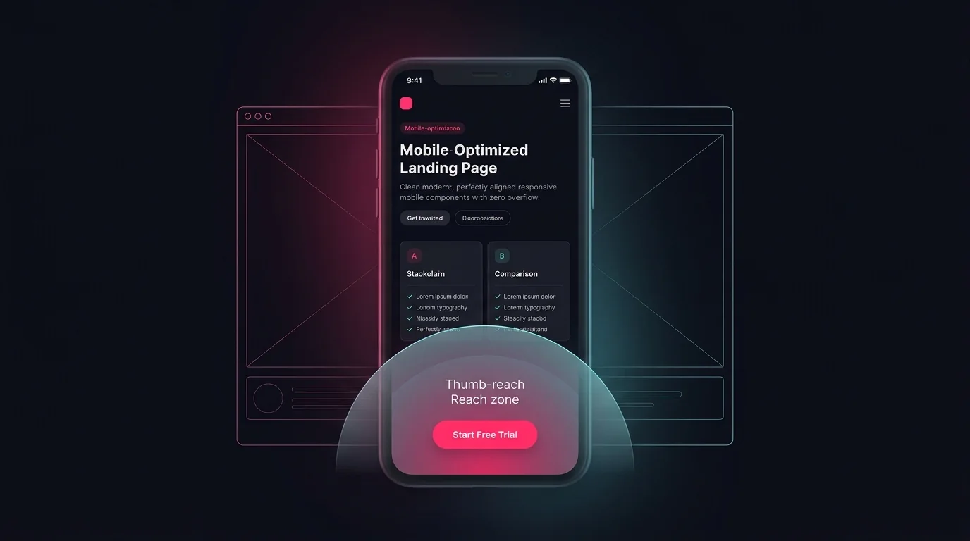
Best for: Fixing sites that “technically work” on mobile but feel cramped, or building mobile-first from the initial design sprint.
Reality check: Browser device emulation is only a preview. Always open the site on at least one real physical smartphone before sending public traffic.
The Surgical Edit Prompt
Why it works: The most common mistake with an existing AI-generated site is saying “make it better.” The AI then rewrites everything—including the headlines, brand colors, and components you already loved. This prompt acts like a precision scalpel: one problem, strict boundary scope, and everything else frozen.
Best for: Refining a page you already like 80% of without introducing new regressions.
Good examples of “one problem”:
- “The pricing table is unreadable on a 375px screen.”
- “The hero headline is vague and doesn’t mention who this is for.”
- “The contact form shows no visible feedback after submitting.”
Specific problems get specific fixes. Vague complaints get a destructive full redesign you didn’t ask for.
The Pre-Launch Red Team Prompt
Why it works: “Red teaming” means deliberately attempting to break something before the public or your customers encounter it. This prompt commands the AI to review your website through the eyes of a critical QA lead and list everything that could embarrass you, cost you sales, or violate accessibility basics.
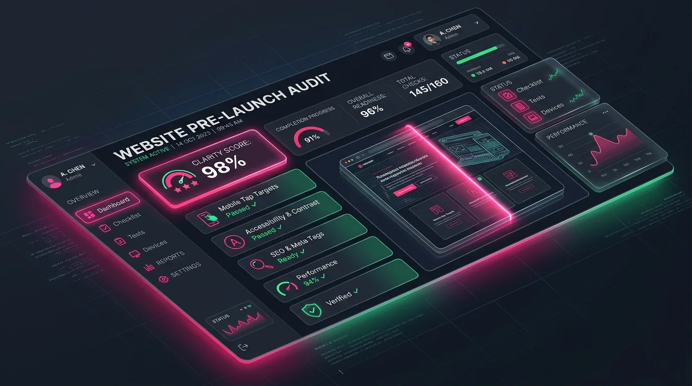
Best for: The final QA pass before you hit publish or start spending money on traffic.
Do not skip the manual human verification:
Tab through the page with your keyboard, submit every form with invalid data, click every outbound link, and test in both light and dark modes. AI review detects patterns; only real interaction verifies execution.
How to Chain the 7 Prompts Into One Seamless Workflow
You don’t need to run all seven prompts every time you create a page. For most projects, following this sequential workflow produces the cleanest results with the least friction:
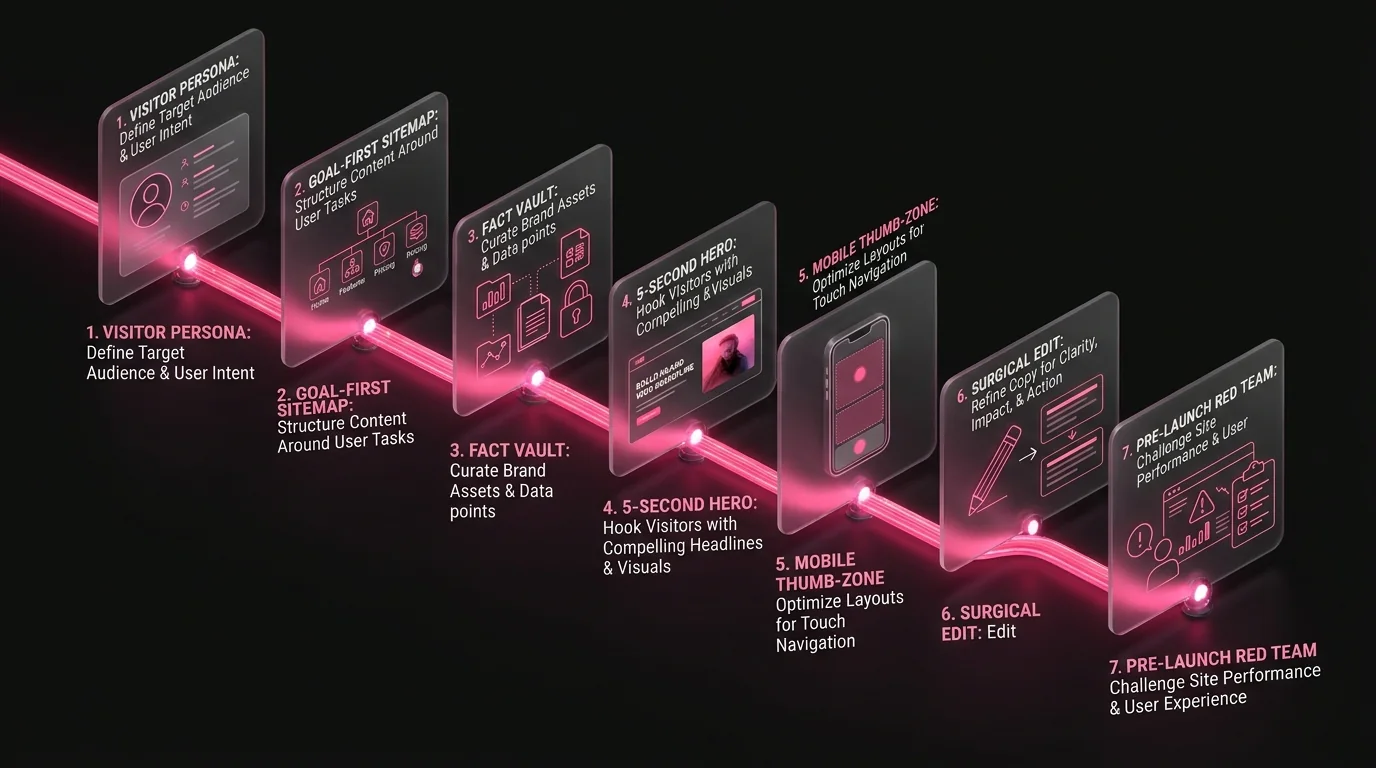
Secret 1: Visitor Persona
Define who the visitor is and what they worry about.
Secret 2: Reverse Sitemap
Work backward from your primary conversion goal.
Secret 3: Fact Vault
Lock the real claims and mandate visible placeholders.
Secret 4: 5-Second Hero
Test 3 angles and pick the clearest first impression.
Build the Pages
Feed structured outputs into your builder of choice.
Secret 5: Thumb-Zone Mobile
Refactor tap targets and layouts for phone use.
Secret 6: Surgical Edits
Fix friction points without breaking working code.
Secret 7: Red Team QA
Conduct a thorough pre-launch audit before going live.
Think of it as: Strategy → Proof → First Impression → Mobile → Refinement → Inspection.
Common Mistakes to Avoid
- •Leading with adjectives. "Modern, sleek, minimal" describes a mood, not an objective. Tell the AI what the page must achieve.
- •Skipping real content. If you give no facts, the AI invents some. Always supply your Fact Vault or mandate placeholders.
- •Asking for everything in one shot. Generating a ten-page website in a single prompt yields ten mediocre pages. Work section by section.
- •Treating a preview as finished software. A clean screenshot is not an accessible form, a functioning database, or an optimized bundle.
- •Forgetting the frozen boundary list. Edits without strict boundaries will silently rewrite the best parts of your copy and code.
- •Chasing keywords over clarity. Pages written for search engine spiders instead of real humans rank worse and convert worse.
- •Trusting AI to self-certify quality. No prompt can guarantee accessibility compliance, SEO rank, or zero runtime bugs.
Website Builder Prompting FAQ
What is the best AI website builder prompt?
There is no single magic prompt, but the most reliable prompts state the visitor, the single conversion goal, approved facts, required sections, and how success will be verified. The seven prompts in this guide cover each phase systematically.
Can I use these prompts with ChatGPT, Claude, Gemini, or no-code builders?
Yes. They are completely model-agnostic. Adjust the final output instructions depending on whether your tool produces HTML/Tailwind code, visual layouts, or written marketing strategy.
How long should an AI website prompt be?
Long enough to eliminate ambiguity, short enough to stay organized. For a focused task like a hero section, 100 to 200 words is optimal. Full-site briefs can be longer, but break them into sequential phases rather than one giant block.
How do I stop AI from making up testimonials and statistics?
Use the Fact Vault pattern (Secret 3). Supply the exact facts permitted, require visible placeholders like [ADD REAL TESTIMONIAL] for missing proof, and demand a "claims needing verification" audit before outputting final copy.
How do I improve an AI-generated website without rebuilding it?
Use the Surgical Edit prompt (Secret 6). State one specific problem, specify the exact allowed scope of change, freeze everything else, and demand a before-and-after verification method.
Do these prompts help with search engine rankings (SEO)?
They help indirectly by producing cleaner heading hierarchy, unique value propositions, and useful content that keeps visitors engaged. Rankings depend on many technical and authority factors that no prompt can guarantee alone.
Will AI-built websites work well on mobile screens?
Only if you explicitly demand thumb-zone ergonomics and test on real devices. Use the Thumb-Zone prompt (Secret 5), then verify on a physical phone to test tap sizes and scrolling fluidity.
Is it safe to publish an AI-generated site as-is?
Never without human inspection. Verify all factual claims, test every form and interactive link, and execute the pre-launch red-team audit (Secret 7) before launching.
Final Thoughts
AI can generate a webpage in seconds, but it cannot know your customers, your real proofs, or your business priorities unless you give it a structured framework. The seven prompts in this guide move the conversation from “make it look nice” to “help this specific person take this specific action, using only claims that are verifiable and true.”
Start small. Pick Secret 1 today, write your one-sentence visitor, and notice how much sharper and punchier the next generated page becomes. Then layer on the rest as your site develops.
A great website begins with a rigorous brief, and finishes with a real person testing it on a real phone.
Ready to create high-performing prompts?
Explore our curated library of production-tested templates and build optimized prompts in AI Prompt Studio.